Personalized Magnets · Published by Moment Keeps Gifts · September 22, 2026
How to Match Wedding Magnet Favors to Your Wedding Colors
Quick answer: Bring your wedding colors into your magnet favors with coordinated cards, readable lettering and a clear design brief. See two real product examples.
Last updated September 23, 2026.

Your wedding favors can belong to the same color palette as your invitations and table settings without copying every detail. With custom wedding magnet favors, the illustration, backing card and wording each offer a place to repeat a color. The useful question is which element should carry the strongest color, and which should stay quiet.
Start with one main color, one supporting accent and a neutral background. Then decide how much of each you want guests to see. Here is a practical way to turn a wedding palette into a clear, personal magnet-and-card design.
1. Choose one reference for your wedding colors
A folder of inspiration can contain several different versions of “sage,” “blush” or “burgundy.” Before requesting a design, choose one reference that best represents the look you want: your invitation artwork, a small palette image or a photograph of the stationery you have already selected.
Label the colors by their job. For example: cream for the background, olive green for the lettering and a little dusty pink for decoration. This gives the designer more direction than three color names alone. If one shade matters most, say so explicitly.
Color codes can help communicate your preference, but they are a design reference rather than a guarantee of an exact printed match. Screens, photographs, paper and printed acrylic can show colors differently. If a close match to existing stationery is essential, discuss that requirement before ordering.
2. Let the backing card carry the wedding palette
The card offers more open space than the magnet. It is a good place for a strong background, a floral accent or a colored border, while the magnet keeps the venue or couple illustration as its main subject.
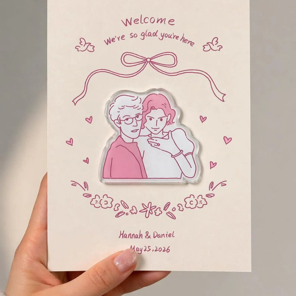
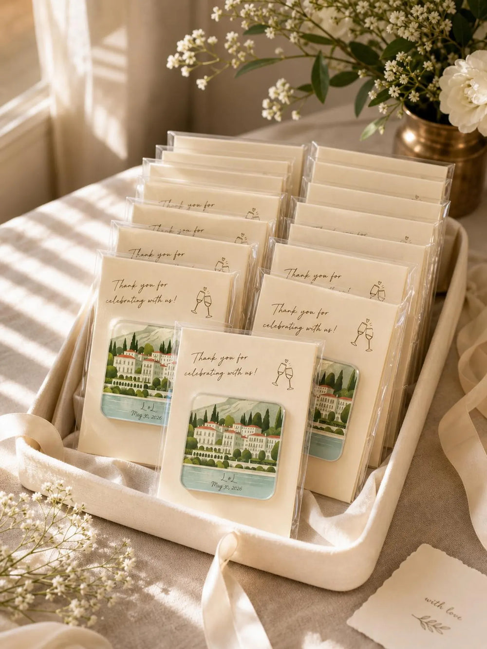
In the green-and-pink example above, the cream card leaves the illustration easy to see. Olive lettering echoes the garden colors, and the pink outline introduces a second color in a small amount. You could use this arrangement when your stationery has several colors but you want the favor to feel light.
For a bolder arrangement, use a deep card color with a lighter magnet illustration. Think about the complete set first, then look at the magnet on its own: guests may remove it from the card and keep it on a fridge.

3. Keep the venue recognizable
You do not need to recolor an entire building to match your flowers. If its red brick, pale stone or green grounds are part of what you love, keep those features in the illustration and bring your wedding colors into the card instead.
For example, a red-brick venue can sit on a cream card with navy lettering. A garden setting can keep its greens while a blush border connects it to the rest of your stationery. This gives the favor a connection to both the place and the celebration.
Send a clear reference photo and explain which details you want preserved. Our wedding venue photo guide explains how to choose an image that shows the building clearly.
Four palette directions to discuss with your designer
These are starting points for a custom design brief, not fixed product options. The final colors and layout should be reviewed in your proof.
| Palette | Card direction | Magnet direction |
|---|---|---|
| Sage, cream and blush | Cream background, darker green text and a small pink detail. | Keep the garden greens and let the building remain the focal point. |
| Burgundy and warm neutrals | Deep background with clearly readable light lettering. | A pale venue illustration for contrast against the card. |
| Dusty blue and ivory | Ivory background with blue accents and darker text. | Use blue selectively in the sky or illustration details where appropriate. |
| Terracotta and olive | Neutral background with an earthy border or heading. | Preserve warm architecture and natural foliage rather than tinting everything. |
4. Give names and dates enough contrast
A pale color can work beautifully in a border but disappear when used for small lettering. Treat decorative details and essential information differently. Names, dates and a thank-you message should be easy to read against the background behind them.
Keep longer wording on the card so it does not compete with a small illustration. Ask to simplify a busy area or darken the text if needed. A large proof on a laptop can make tiny words look more readable than they will on the finished piece, so consider the proposed physical dimensions during your review.
If you need a shorter message, browse our wedding favor thank-you card wording ideas. Choosing the words early helps the designer balance color, spacing and artwork.
5. Send a clear customization brief
You do not need to design the favor yourself. A reference photo and a few specific preferences give us a useful starting point. Here is an example you can adapt:
“We would like a venue magnet with a cream backing card. Our main color is olive green, with a small dusty-pink accent. Please keep the building close to the reference photo, use darker lettering for readability and add ‘Thank you for celebrating with us.’ Our names are Emma & Alex, and our wedding date is June 12, 2027.”
Include your quantity and the date you need the order in hand. Tell us whether the magnet is a wedding-day gift or a save-the-date announcement, because the card wording will be different.
From color brief to approved acrylic design
- Choose your product and references. Select the quantity and thickness, then provide the venue photo, palette reference and exact wording.
- Explain the priorities. Identify the main color, the accent and any building details that should remain true to the photo.
- Review the digital proof. Check the card and magnet together, then review the magnet alone. Confirm spelling, dates, contrast and spacing.
- Approve the final layout. Production begins after approval. Allow time for any revisions as well as production and delivery.
Our hand-drawn wedding venue magnet packages include one custom artwork, a coordinated backing card per piece and a digital design proof. The current listing offers a square 3mm version and a custom-outline 5mm version; choose the option that fits your intended design. Additional artwork is quoted separately.
Common color questions
Can the magnet and card be different colors?
Yes. A shared accent, repeated lettering color or coordinated illustration can connect them. The whole background does not need to match.
Will my printed favor look exactly like the screen?
Colors may vary between screens and printing. Use the proof to confirm the intended palette and layout, and raise any critical color requirement before approving production.
Should every favor use a different palette?
One consistent design can tie a display together. If you want several card colors or artwork versions, contact us with the quantities for each version before ordering so the options and any additional costs can be confirmed.
Ready to coordinate your wedding favors? Explore our custom wedding magnet favors, then send your photo, preferred colors and wording to Moment Keeps Gifts. We will use your references to prepare a personalized design for you to review.